'Bloom' Florist App
Media support for this case study is only available on Desktop. Mobile support is coming soon.
Built with

Role: UX Designer and Researcher
Completed end-to-end product design process by creating empathy maps, personas, user stories, and user journey maps to understand user needs. Created wireframes and low-fidelity mockups and prototypes. Conducted User Research and used findings to create high-fidelity prototype with Material Design 3.
Problem
Individuals who regularly go to a local florist were becoming frustrated with not being able to preplan their floral arrangements before going to the florist shop. Thus, they needed a quicker, more efficient way of creating and choosing floral arrangements before leaving their homes.
Outcome
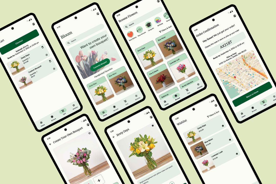
The solution I built is a mobile app called “Bloom” that allows users to digitally preview floral offerings, design custom bouquets, and order for instore pickup. Bloom facilitates the entire end-to-end retail experience from browsing to pickup.
Understanding flower enthusiasts and their needs to design the smoothest digital process possible.
User Research Summary: Before tackling the design problem, I had to conduct preliminary user research to better understand the audience. This step included interviewing flower enthusiasts to better understand their pain points when visiting the florist and how a mobile app could facilitate the process. Initially, I assumed that users simply wanted to browse flowers and order for pickup; however, user research showed that users wanted to browse for flowers through various categories, customize bouquets, learn how to care for their arrangements, and order for instore pickup.
Pain Points: The pain points that the target users were facing were a combination of process and support pain points.
- Process: Can't order arrangements digitally. Users were frustrated by not being able to order flowers digitally, thus the mobile app will allow them to pay online and order for instore pickup.
- Support: Aren’t aware of what new arrivals to expect. Users felt that since flowers were switched out weekly, they didn’t know what to expect at the florist. Thus, the design will incorporate a “new arrivals” category that users can browse beforehand.
- Process: Can’t digitally customize bouquet. Users wanted to be able to customize bouquet digitally, rather than at the florist shop, so the design should allow users to do so.
- Support: No information about floral care. Since users felt there was no personalized information regarding floral care for arrangements, the design should implement this information under each bouquet.
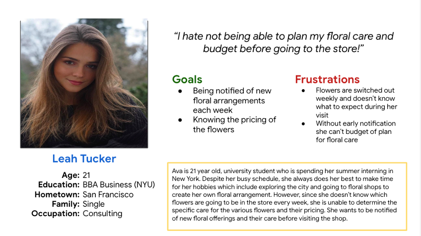
Problem Statement: Leah is a busy consulting intern who needs a quicker, more efficient way of planning her bouquet and budget in advance because walking around the florist shop aimlessly takes too much time and is overwhelming.
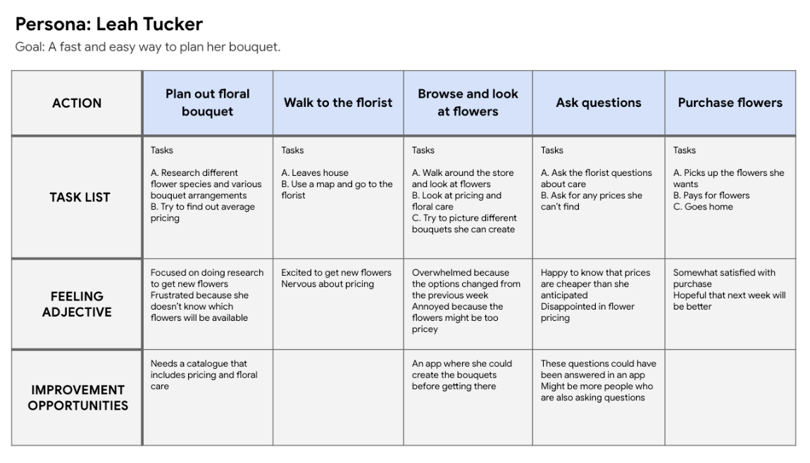
User Journey Map: Leah would like a fast and easy way to plan her bouquet. This can be resolved with a digital solution that includes new arrivals and pricing information.
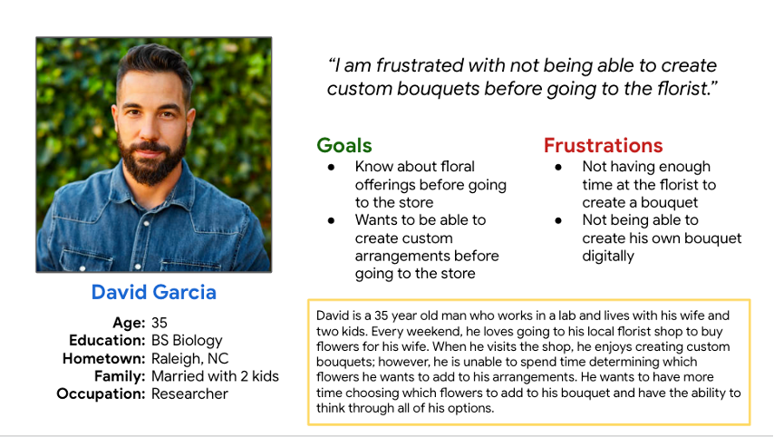
Problem Statement: David is a flower enthusiast who needs a digital way to create custom bouquets because he wants to spend more time determining which flowers to include in his arrangement.
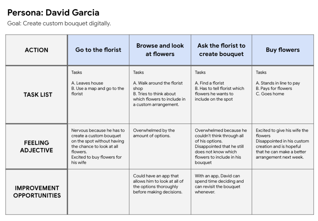
User Journey Map: David would to create custom bouquets without becoming overwhelmed at the florist. This can be resolved with a digital solution allows him to browse all flowers he could include, edit the arrangement, and revisit it when he is ready to purchase.
A digital solution to bouquet shopping is a key priority for our users.
Paper Wireframes
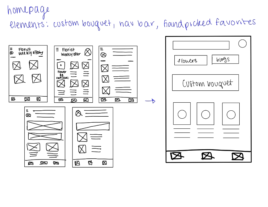
To begin the design phase, I created five different versions of each screen before deciding on a refined version. The image above shows the design process for the homepage.
Digital Wireframes
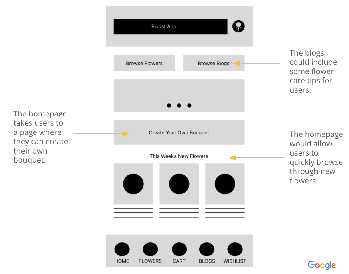
When starting the design, I tried to address as many pain points, as I could on the home screen, since this is the first page users would see when opening the app. This includes a blogs button to show care information, custom bouquet button, and this week’s new flowers.
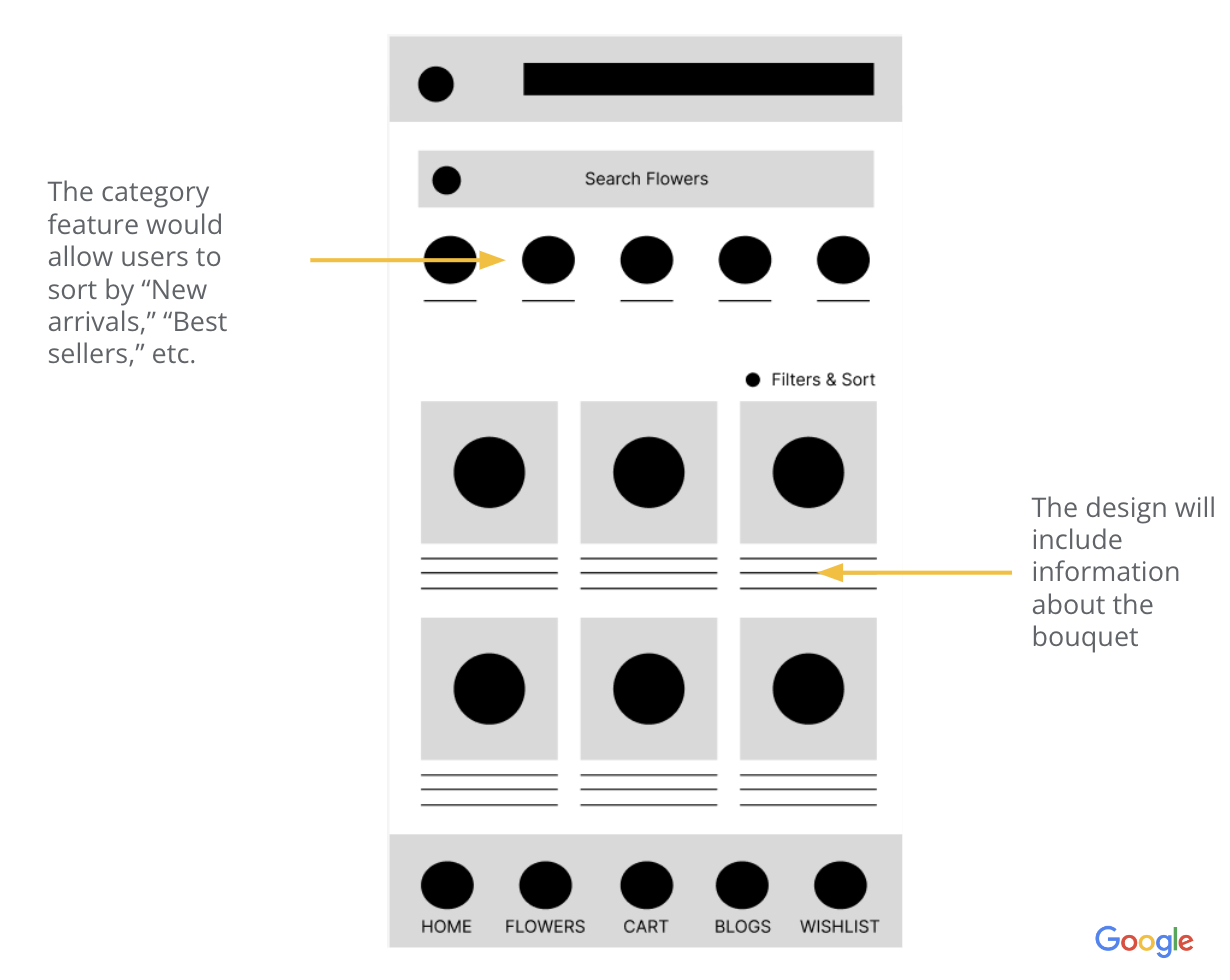
When creating the digital wireframes, I thought about ways to alleviate user pain points. In this “browse flower” screen, I focused on ensuring that users could sort the offerings by “new arrivals.” This would allow them to see them before going to the store or purchasing online.
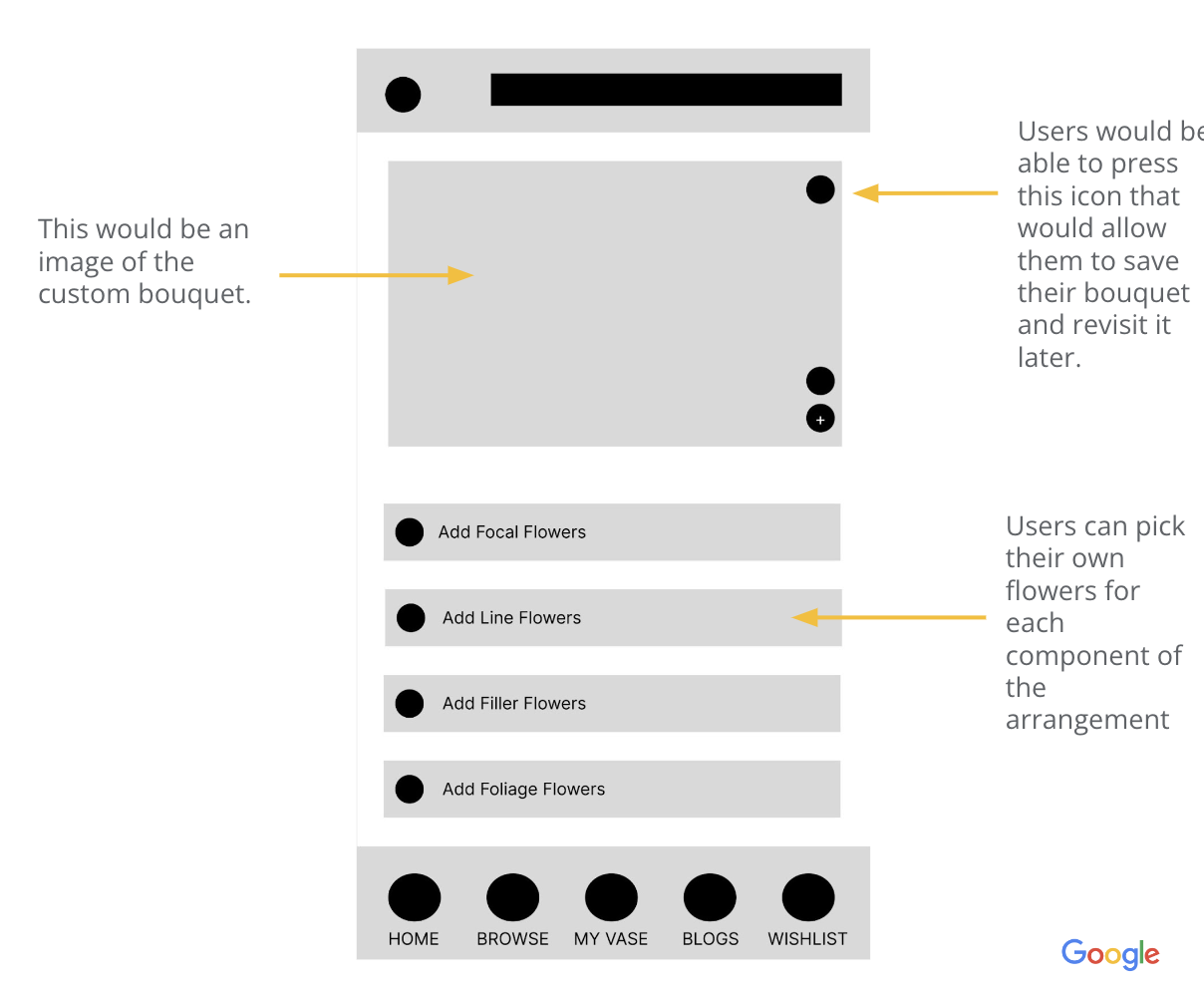
This wireframe shows the customize bouquet page. Users are able to pick each of the flowers with a drop down menu and are able to save their bouquet for later if they wanted to take the time to pick flowers and revisit it later. Additionally, the add button allows users to add their bouquet to cart.
Usability Testing
Usability tests were conducted with five different participants, and through this process, I was able to come up with themes and develop insights for improvement opportunities.
Findings:
- The drop down menu for bouquet customization was hard to use, so users need a more intuitive way to add flowers to their personal bouquets.
- It was unclear as to what part of the bouquet the users were customizing, thus users needed help understanding what each part meant (ex: focal flowers).
- The plus icon for adding flowers to cart was misleading, so there should be improved cues such as creating a bigger button that says “Add to Cart.”
Feedback was used to improve designs for the next stage.
High-Fidelity Mockups
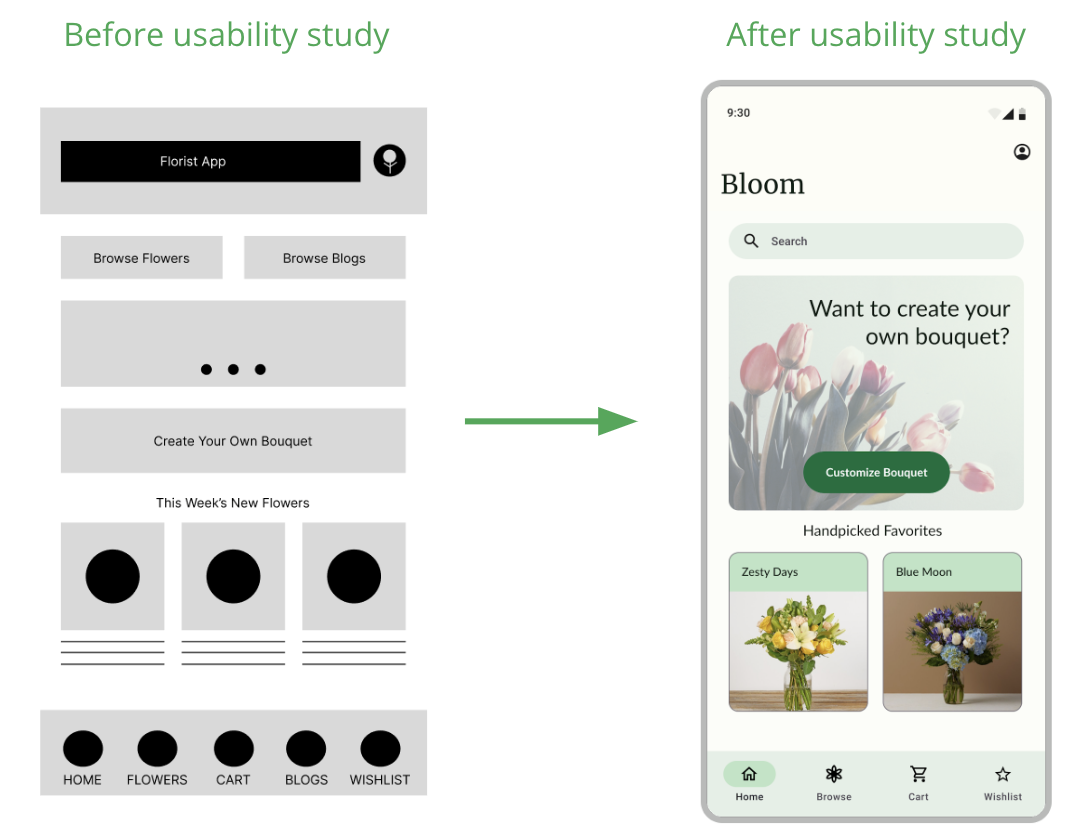
When reevaluating the goals of the users, I realized that “ floral care blogs” were not an essential part of the design. Flower care information could instead be added under each individual flower page. Thus, blogs were removed from the home page and navigation bar. Additionally, I implemented a search bar, so users could easily look for what they might need.
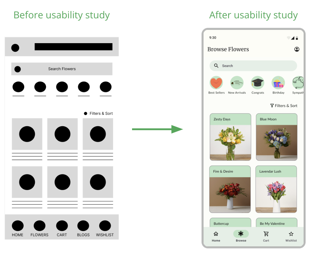
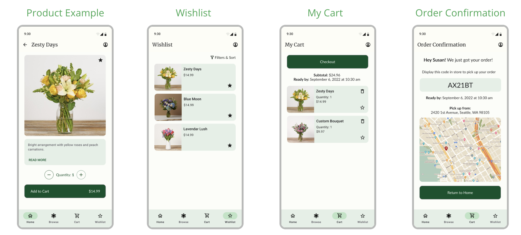
The low-fidelity design and the mockup were relatively similar. However, only having two arrangements were row reduced clutter, improved reliability, and was better optimized for 18:9 aspect ratio devices.
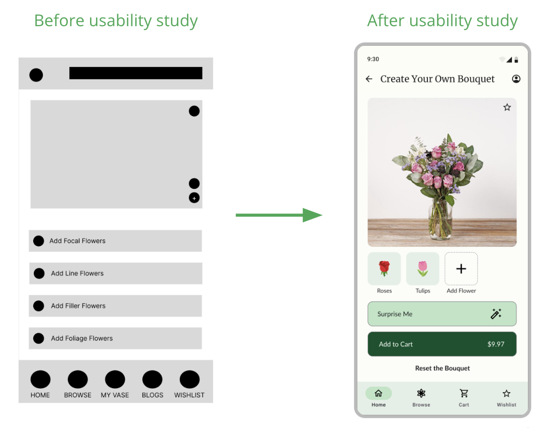
After the usability study, it became clear that the low fidelity wireframe was difficult for users in creating their custom bouquets. Thus, it was completely redesigned. Users are prompted to click on the “Add Flower” button to add flowers to their bouquet.
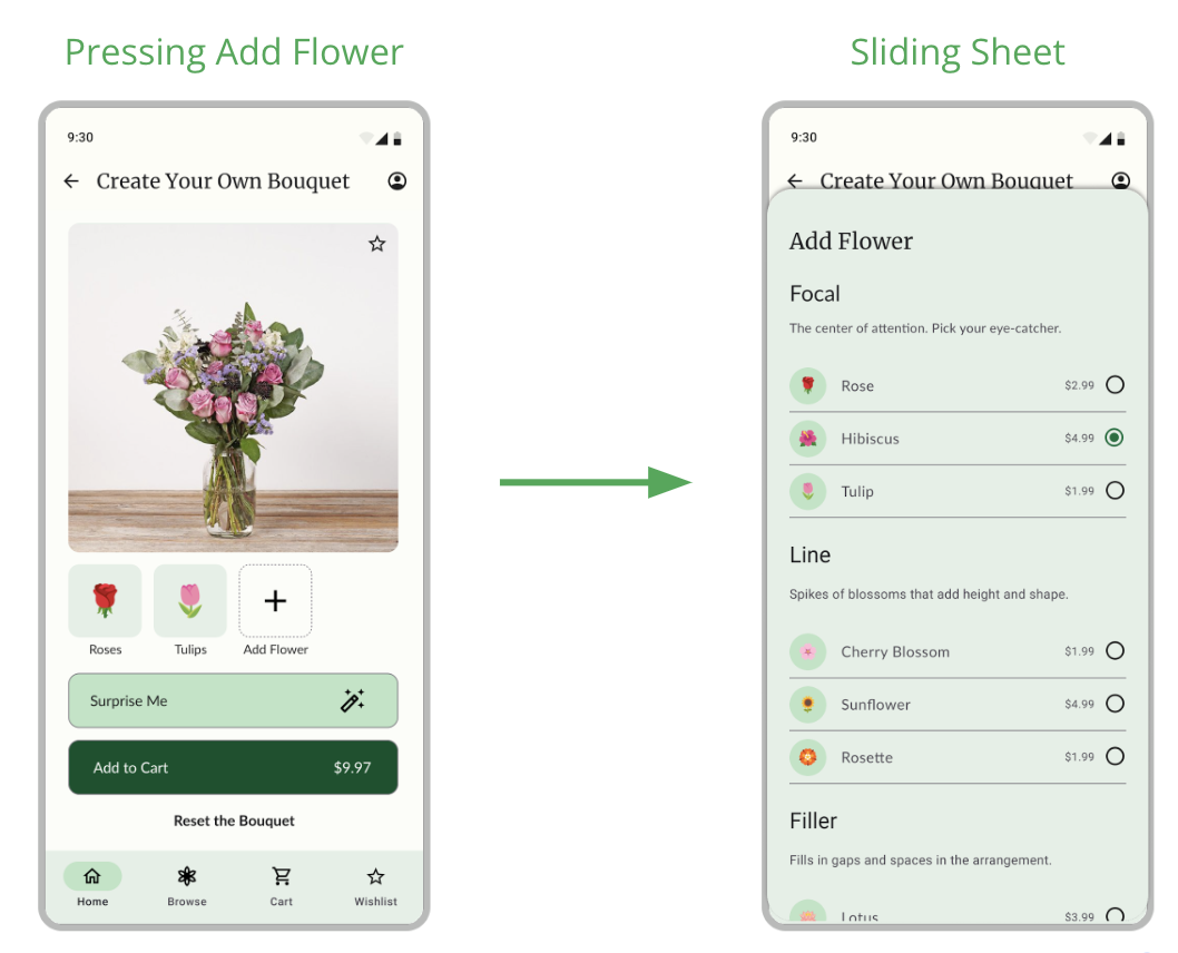
When users click the “Add Flower” button, it results in a card that slides up displaying the various types of flowers and the ability to add them to the bouquet. Additionally, I included phrases for each type of flower, helping users understand what part of the bouquet they’re developing.
Acessibility considerations are essential as a core part of design.
Throughout the design, I made sure to include light text on dark backgrounds and dark text on light backgrounds. This ensured that every part of the design with text has good readability.
An accessibility consideration that I prioritized was ensuring that buttons were spread apart, so individuals do not accidently click on the wrong button. This is demonstrated through the quantity buttons (on flower pages) and the delete and star buttons (on my cart page).
I applied Gestalt Principles (similarity) on the action buttons. For example, “Add to Cart,” “Checkout,” and “Return to Home” are each the same color because they are all actions.
What I've learned
Throughout this project, I learned that I had to put my initial assumptions about the user aside and instead focus on understanding user pain points through research and testing. Throughout the process, constantly referring back to user personas and user feedback proved to be the key for iterative design. Taking the time to talk to users and remembering their needs throughout the design process ensures that each element of the florist app was optimized for accessibility and efficient user flow.