Bing Revamped: Responsive Web Design
Media support for this case study is only available on Desktop. Mobile support is coming soon.
Built with

Role: UX Designer
Redesigned Microsoft Bing homepage as a Responsive Web Application using Fluent UI Design System by applying Hick's Law to reduce overall complexity and applying cognitive bias principles to alleviate user pain points.
Problem
Internet users need an improved Bing homepage because the current homepage is cluttered,
difficult to navigate, and does not highlight Microsoft’s most used products.
Outcome
My redesigned Bing homepage declutters, highlights the most important aspects of the user flow, and is centered around productivity users who are the target audience for Bing by emphasizing work items and leveraging the power of the Microsoft Office suite.
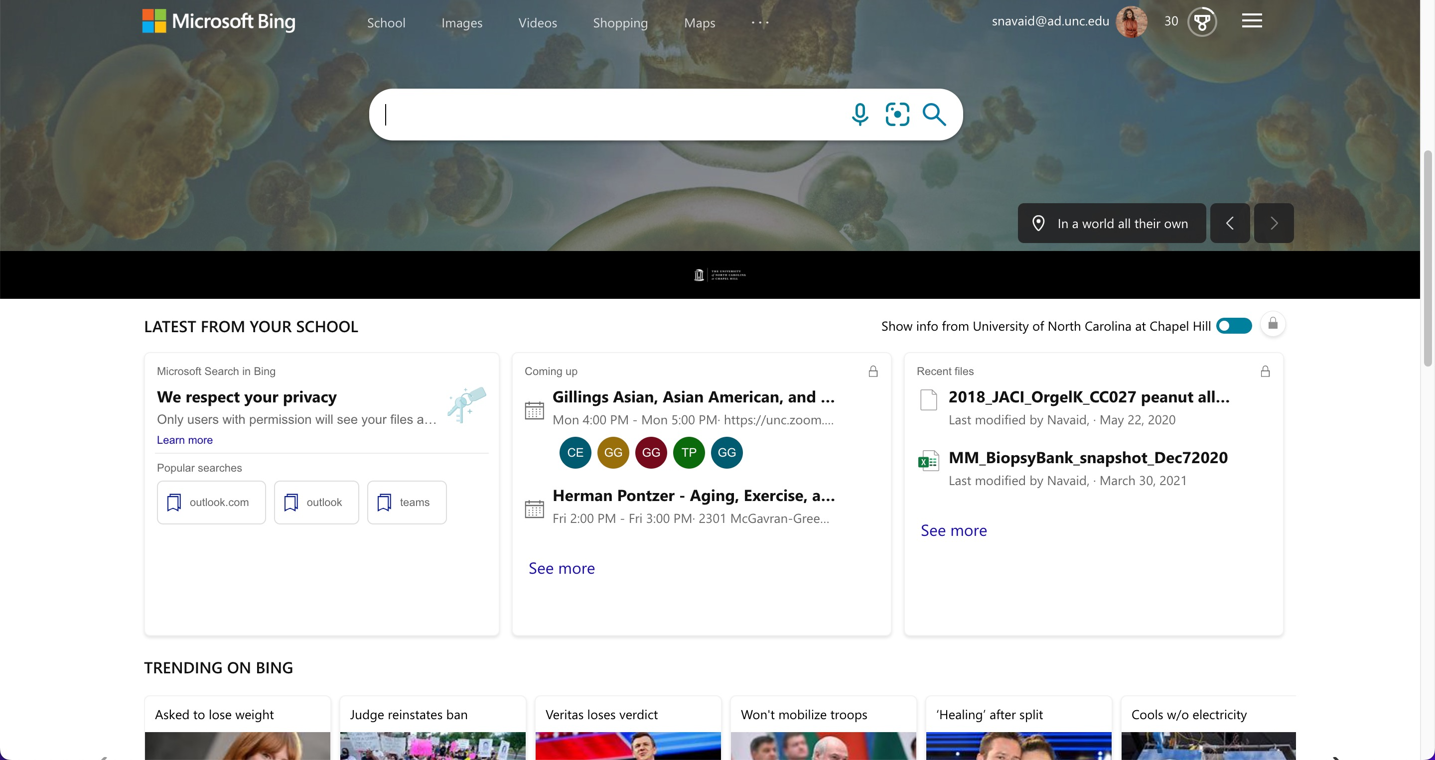
What is currently wrong with Bing?
The current Bing homepage includes a background image, navigation bar, search bar, work/school
related information, and trending headlines. While it includes everything and more that an
internet user needs to search the web and browse through complementary information, the current
design lacks organization and hierarchy while being cluttered. Giving users too many options on
what is meant to be a search engine, disregards Hick’s Law which states that the time it takes
to make a decision increases with an increasing number and complexity of options. Another
problem with the current design is the use of a background image that changes daily. First,
including a large image on the page can slow down performance. Additionally, including a
background image makes the top navigation bar difficult to see which can pose an accessibility
issue for those who may be visually impaired.
Additionally, the current design does not promote current Microsoft products, which could be a
missed opportunity for being a productivity hub. Bing users tend to be customers of Office 365
and so not having a coherent structure or full integration with Bing is a missed opportunity to
meet the needs of power users. These elements should be a core aspect of the design which will
aid Bing's mission of being an all-in-one productivity search platform for Office 365.
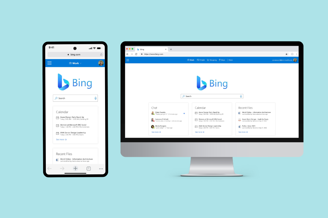
My Design is Bing: revamped, refocused, and responsive first.
The first issue in the original design is that it is cluttered and lacks organization and
hierarchy
which can overwhelm users. Thus, I used Jakob’s Law which states that since users spend most of
their time on other sites, it is important that users prefer new sites to work similar to sites
they are familiar with. According to Pew Research Center, 83% of individuals use Google over any
other search engine, thus I wanted to incorporate Google’s simplicity into the redesign while
also showcasing Bing as a productivity hub. First, I removed the background image which helps
users see various options and choices more clearly. Next, I made the Bing logo much larger to
create distinction between other search engines with the search bar right underneath, to show
hierarchal importance. Additionally, I reorganized Bing’s current productivity hub into 3
similar cards under the navigation bar, following the Law of Proximity and Law of Similarity.
This helps users mentally group “Chat,” “Calendar,” and “Recent Files” to understand the
relationship between each card and organize the information much faster.
To ensure consistency in my design, I used the Fluent UI Design System by Microsoft. This
ensured that inconsitent components in the current Bing design, such as rounded search bars or
different iconography is replaced with one cohesive brand identity that runs throughout the
Microsoft ecosystem.
Additionally, my new design focuses on promoting Microsoft products. I did this by creating a
side menu and launcher, which when opened, showcase frequently used products such as Outlook,
OneDrive, Word, etc. By doing so, it emphasizes Bing’s purpose of being a productivity hub where
users can quickly edit files, schedule/join meetings, and collaborate with others for either
school or work. It also brings the Bing product in line with other Office 365 tools which
already feature this side menu app launcher.
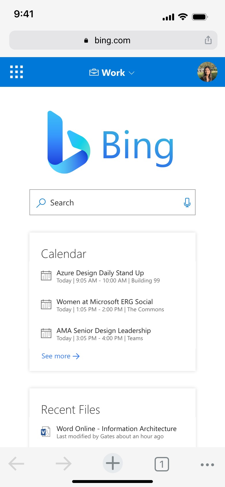
To create a mobile version of Bing, it was important to think of ways to redesign for smaller screens. For example, the top navigation bar that includes work, images, shopping, maps, and more was reformatted to be a drop down menu that users can switch between. Additionally, the “Chat,” “Calendar”, and “Recent Files” cards could not be placed horizontally in a mobile version, so instead they are placed vertically in order of most importance where users can scroll down to view the others.