Error 404 Redesigned
A revamped Error 404 page for the US National Park Service.
Media support for this case study is only available on Desktop. Mobile support is coming soon.
Built with

Role: UX Designer
Redesigned the Error 404 page for the US National Park Service to make it more intuitive, functional, and easy to navigate.
Problem
Adventurers who use the National Park Service website often stumble on broken links or unfound pages. The current 404 Error Page has limited functionality to help redirect users and gives misleading instructions.
Outcome
My solution incorporates redirect functionality at the center of its design, allowing users to search the site instantly and proposing suggestions to help them get back on track. It does this via a redesigned Error 404 Page with improved branding that fits the US National Park Service Identity and provides a user-friendly mechanism to explore the site further.
Misleading users can lead to fustration, lack of trust, and poor experience.
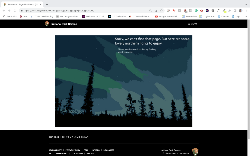
The current Page Not Found design for the US National Park Service features a randomly generated image relating to the outdoors with text inside.
The text includes a pun of some sort followed by instructions of how to search for what you are looking for. The issue here is that the text "try the search bar at upper right to find what you need" is confusing because there is no search tool in the top right of the page.
The user assumes this refers to the menu button, but when they click this button they get no response as the menu button does not work on the Page Not Found page. The only way to actually reach the search tool is to click the National Park Service text in the top left to be redirected to the main page. There the user will find a search tool.
This not only confuses the user, but fails to provide a clear user flow for searching the site. The lack of response from the menu button further adds to the confusion.
Light text on a light background fails to provide the color contrast needed for Accessible Design and makes text hard to read.
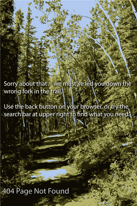
Another issue is that the text within the image does the contrast the image background enough. This lack of contrast makes the text difficult to read - particularly for users with visual impairments. The text itself is small in size, and since the text is within the image itself, the text size relies directly on the image size. Thus, for users accesing the site on different aspect ratios or screen sizes (e.g. Mobile vs Desktop) inconsistencies can arise in text size - meaning on some screens the text can be too small to read.
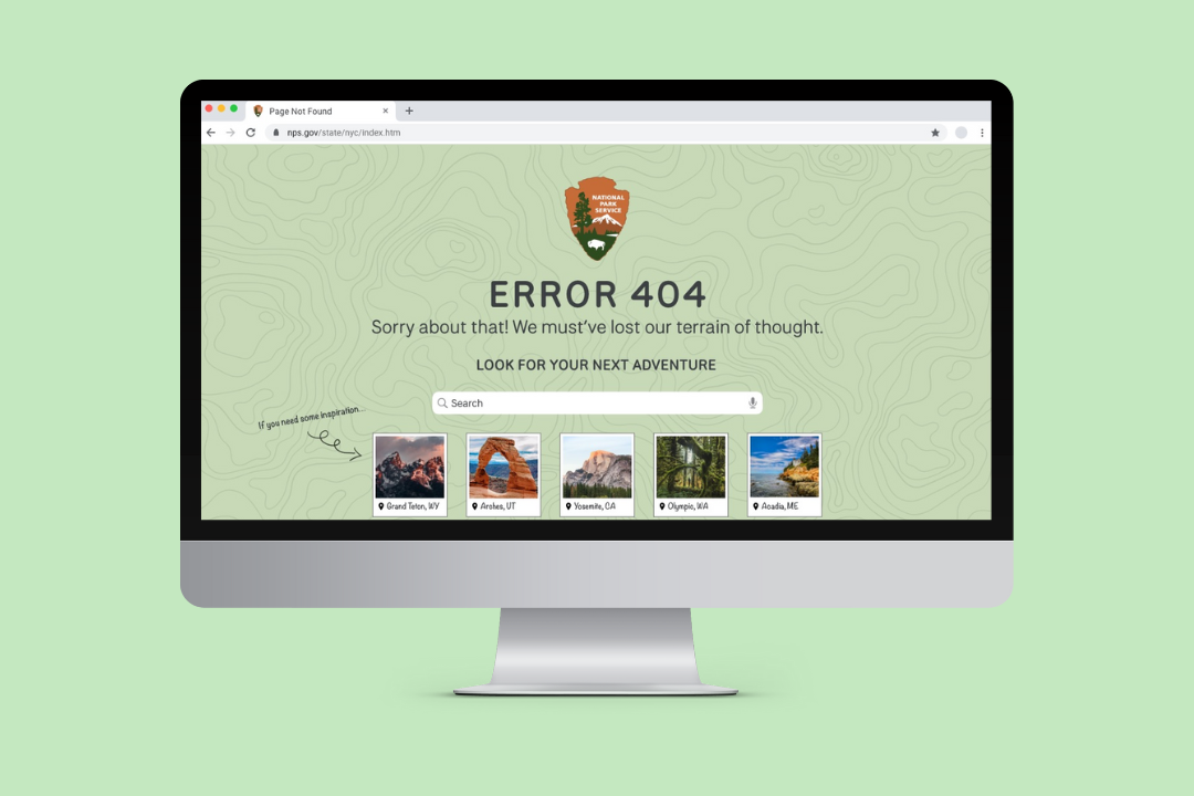
My Design
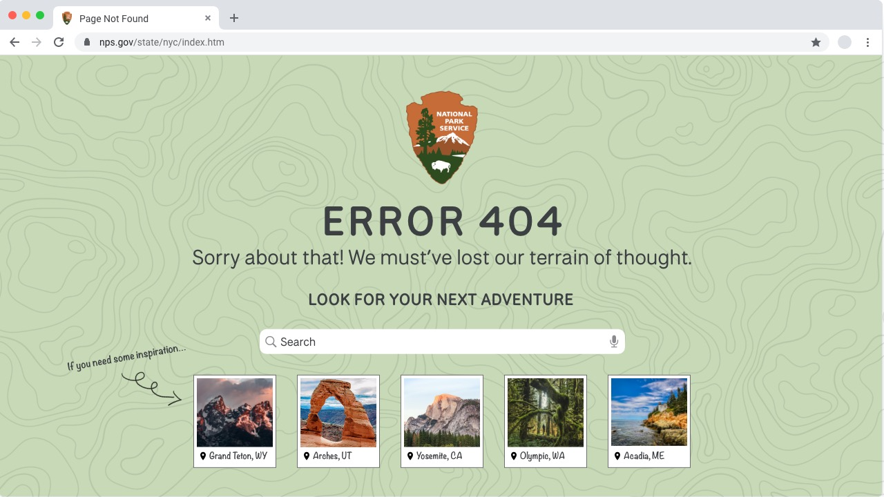
The first issue of the original design was that it misleads users and lacks a clear user flow for finding the search tool. I solved this by removing the need to find the search tool and implenting it directly into the Error 404 page. This provides an easy-to-use mechanism for the user to redirect to pages they want to explore on the site without having to pass several hurdles to get there.
The new design also makes it very clear that the user is still on the National Park Service page, but has hit a dead end. The error 404 message is the largest text on the page, making it clear the page was not found.
The funny pun is preserved from the original design as a means to use light hearted humor to reduce the frustrations the user may experience from landing on this page in the first place since it means they haven't reached the page they were hoping to get to.
The text "Look for your next adventure" further cements the functionality of the search box and is consitent with the National Park Service brand. The background color is set to green due to its connotations with nature as well as representing new beginnings and growth as the user embarks on a new journey through the site.
Finally, new functionality is added through the cards at the bottom that show different national parks. These are intended to provide inspiration to the user as they search but can also be clicked if the user is interested. This can be personalized to the user's interests through a recommendation algorithm that would further reduce the time it takes for the user to find a hike of their interest.