Rethinking Boarding Passes
Media support for this case study is only available on Desktop. Mobile support is coming soon.
Built with

Role: UX Designer
Redesigned boarding passes for airlines to allow for design differentiation between competitors and more branding opportunities.
Problem
Flyers need an improved boarding pass because the current boarding pass lacks appropriate grouping of data. Additionally, each mobile boarding pass for each airlines follows the same formatting and layout, thus displaying a lack of branding for each airline, which is a missed marketing opportunity.
Outcome
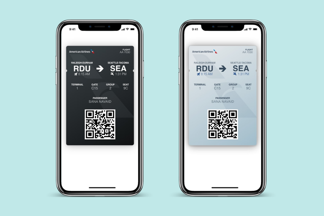
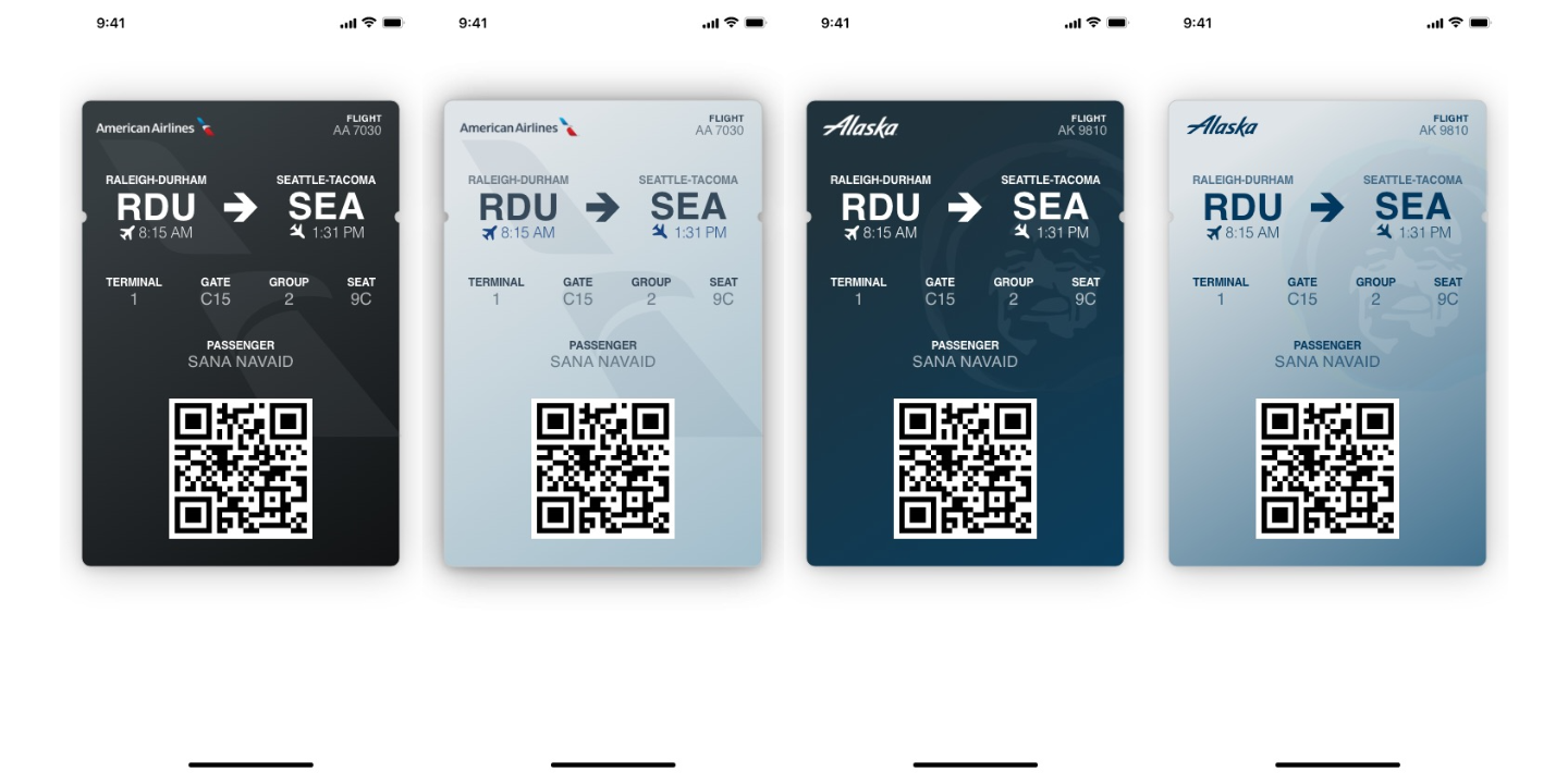
My redesigned boarding pass logically groups together data to facilitate and accelerate the boarding process for flyers and reflects each airline company’s personal branding by integrating their logos and color palettes into the design.
Lack of branding in airline boarding passes is a missed opportunity
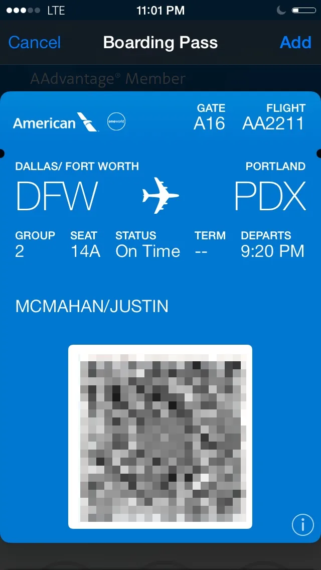
The current airline boarding passes found in Apple Wallet include essential flight information such as gate, flight, departure/arrival airport, group number, seat number, flight status, terminal, departure time, and passenger name. While it includes everything a flyer needs to know about how to navigate the airport and board the flight, the digital boarding pass fails to group flight data appropriately. Not organizing the information completely disregards the Gestalt Principle of Proximity, thus requiring users to spend more time understanding the boarding pass information.
Additionally, the current design does not reflect each individual airline company’s branding, thus making all mobile boarding passes indistinguishable. The only indicator of airline branding is the small logo in the top left corner of the screen which can be easily overlooked. Lack of branding affects all stakeholders, as it demonstrates a missed marketing opportunity for airlines. Additionally, users are impacted, especially when they might have a multi-city journey via different airlines. Having two very similar boarding passes can confuse flyers and slow them down during stressful traveling.
My Design
The first issue in the original design was that it does not appropriately group flight data. I solved this by implementing the Gestalt Principle of Proximity and rearranging data that is related. For example, I grouped together terminal, gate, group, and seat number and organized them by following the logical steps a user would take from entering the airport through sitting down on the airplane. Applying this principal would help user understand and mentally organize the information more efficiently.
The core feature of my design is to create a system of common elements that airlines can use to add branding to their boarding passes. Airlines will be able to customize the logo in the top left corner, background color/gradient, and semi-transparent logo in the background. This ensures boarding passes of different airlines have enough elements that can be changed such that the passes can be differentiated while limiting the amount of work airlines would need to do to support this.
Lastly, I added in the departure and arrival time under the departure/arrival airports. This addresses the incohesive design and poor usability reflected in the original boarding pass where it includes this information as “Status” and “Departs.” This would automatically update and notify the flyer If the flight becomes delayed.